Move Product Thumbnails to the Left Side on Desktop in Shopify
Looking for a design trick to instantly elevate your Shopify store’s user experience (UX)? Focusing on how your product media is displayed is critical.
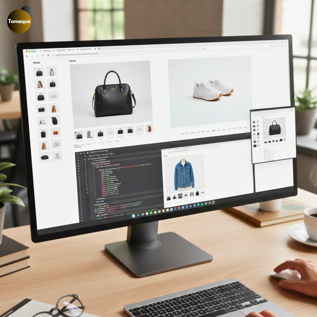
By default, many Shopify themes position product thumbnails (the small image previews) stacked neatly below the main product image. While functional, this placement often results in a lot of unnecessary scrolling and a less efficient use of screen space.
The Modern Layout Solution:
Moving your product image thumbnails to the left side creates a much cleaner, more intuitive, and visually balanced layout, particularly on desktop screens. This adjustment improves navigation, boosts product visibility, and gives your entire Shopify product page a modern, professional look.
In this guide, we’ll walk you through the process of making this structural change, helping you optimize your store’s media display for better engagement!
“Shopify empowers entrepreneurs to turn ideas into reality with just a few clicks.”
Why Move Product Thumbnails to the Left?
1. Better User Experience
Placing product thumbnails on the left aligns with natural reading patterns (left to right). This makes it easier for customers to scan product images without excessive scrolling.
2. More Professional Look
Many high-end eCommerce websites use a left-side thumbnail layout, giving your Shopify store a modern and sophisticated appearance.
3. Enhanced Mobile Responsiveness
While this change applies to desktop views, a well-structured design also benefits mobile users by ensuring smooth adaptability across devices.
Steps to Move Product Thumbnails to the Left Side in Shopify
Before making any modifications, ensure you backup your theme to avoid accidental loss of important settings.
Step 1: Locate Your Theme’s Product Page Code
- From your Shopify Admin Dashboard, go to Online Store > Themes.
- Click Customize on your active theme.
- In the left sidebar, click on Product Pages to access the product template.
- Identify if your theme provides built-in settings for moving thumbnails. If not, proceed to editing the theme code.
Step 2: Edit the Theme Code
- Go to Online Store > Themes, then click Actions > Edit Code.
- Locate the product-template.liquid file under Sections.
- Find the thumbnail container section, usually represented by a <div> wrapping <ul class=”product-thumbnails”> or similar.
- Adjust the structure to place this section before or beside the main product image container.
Step 3: Apply CSS to Adjust Layout
Once the structure is modified, update the CSS to align thumbnails to the left.
Navigate to Assets > base.css, theme.css, or style.css (depending on your theme) and add the following code:
.product-gallery {
display: flex;
flex-direction: row-reverse;
}
.product-thumbnails {
width: 20%; /* Adjust width as needed */
margin-right: 10px; /* Creates space between thumbnails and main image */
}
.product-main-image {
width: 80%;
}
.product-thumbnails img {
display: block;
max-width: 100%;
margin-bottom: 10px; /* Adds spacing between thumbnail images */
}
Step 4: Test and Optimize
After saving the changes, refresh your store’s product page and check for:
- Correct thumbnail alignment
- Consistent spacing
- Responsive behavior on different screen sizes
If needed, tweak the CSS further to match your theme’s aesthetic.
Alternative: Use a Shopify App
If you’re not comfortable editing the theme code, consider using a Shopify app like PageFly or Shogun that offers advanced customization options without requiring coding.
Customizing the layout of your Shopify store can significantly impact user experience and sales. Moving product thumbnails to the left is a simple yet effective tweak that aligns with modern eCommerce design trends. By following this guide, you can make this change seamlessly and enhance the visual appeal of your product pages.
Need expert help? At ShopifyEcommerce, we specialize in Shopify customizations and theme development to help you create a high-converting online store. Contact us today for tailored solutions!