How to Display Sections on Specific Devices in Shopify
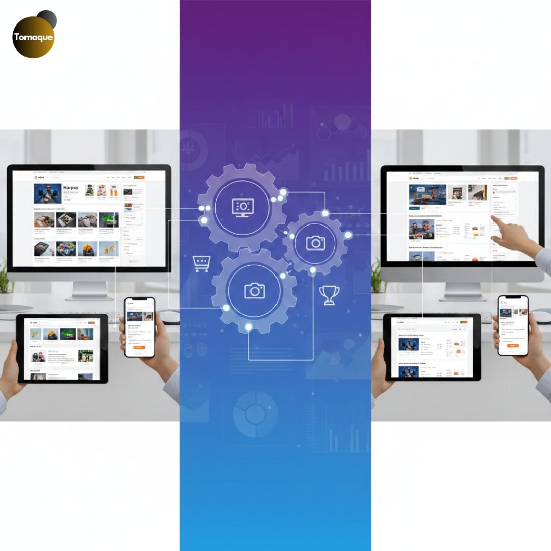
In today’s mobile-first world, ensuring your Shopify store delivers an optimal experience across all devices is crucial. Sometimes, you may want to display certain sections only on desktop or mobile to enhance user experience and streamline navigation. Shopify allows you to control the visibility of sections based on the device type using Liquid code and CSS. In this guide, we’ll walk you through the steps to achieve this effectively.
“Success in e-commerce isn’t about having the best product, but about having the best experience.”
Why Customize Section Visibility on Different Devices?
Before diving into the implementation, let’s discuss why you might want to hide or display sections for specific devices:
- Improved User Experience – Mobile users prefer a simpler, faster interface, while desktop users may expect richer content.
- Performance Optimization – Reducing unnecessary elements on mobile improves page speed and load times.
- Better Conversion Rates – Tailoring content to specific devices enhances engagement and increases conversions.
- Mobile-First Strategy – Hiding large elements or complex layouts can prevent slow load times on mobile.
Now, let’s explore how to display sections for specific devices in Shopify.
Method 1: Using Liquid Code for Device-Based Visibility
Shopify’s Liquid templating language allows us to conditionally display content based on screen width. You can achieve this using the request.design_mode filter and CSS media queries.
Step 1: Modify Your Theme.liquid File
Navigate to Online Store > Themes > Edit Code and open the theme.liquid file. Insert the following Liquid code where you want a section to appear only on mobile or desktop:
For Mobile-Only Sections:
{% if request.design_mode %}
<div class=”mobile-section”>
Your mobile-specific content goes here.
</div>
{% endif %}
For Desktop-Only Sections:
{% unless request.design_mode %}
<div class=”desktop-section”>
Your desktop-specific content goes here.
</div>
{% endunless %}
Method 2: Using CSS Media Queries
Another way to hide or display sections on specific devices is through CSS. This method is useful when you don’t need to modify Liquid files.
Step 1: Add CSS in Your Theme’s Stylesheet
Go to Online Store > Themes > Edit Code, open base.css or theme.css, and add the following CSS:
Hide Section on Mobile (Show on Desktop)
@media only screen and (max-width: 768px) {
.desktop-section {
display: none;
}
}
Hide Section on Desktop (Show on Mobile)
@media only screen and (min-width: 769px) {
.mobile-section {
display: none;
}
}
Using these CSS rules, you can control the visibility of any section without modifying your Liquid files.
Method 3: Using Shopify’s Theme Editor (No Code Approach)
If you prefer a no-code method, some Shopify themes allow you to set visibility options directly from the Theme Editor.
Steps:
- Navigate to Online Store > Themes > Customize.
- Select the section you want to modify.
- Check if the theme provides an option for device-based visibility (some themes do).
- If available, select Show on mobile only or Show on desktop only.
- Save your changes and preview them.
Optimizing your Shopify store’s layout for different devices is a crucial step toward providing a seamless shopping experience. Whether you use Liquid, CSS, or Shopify’s built-in tools, ensuring the right content appears on the right device can enhance usability, speed, and conversions.
If you need assistance customizing your Shopify store, ShopifyEcommerce is here to help. Our team of experts can tailor your store’s design to fit your brand’s needs and boost your sales.
Have questions? Drop them in the comments or contact us today!