Optimize Product Thumbnail Size for Mobile on Shopify
Optimize Product Thumbnail Size for Mobile on Shopify
In today’s mobile-first world, ensuring that your Shopify store is optimized for mobile devices is critical. One of the key aspects of mobile optimization is adjusting the product thumbnail size to ensure fast loading speeds, clear visuals, and an enhanced shopping experience. In this blog, we’ll explore the best practices for optimizing product thumbnails for mobile on Shopify.
“In e-commerce, your website is your storefront—make every click count.”
Why Thumbnail Size Matters for Mobile Users
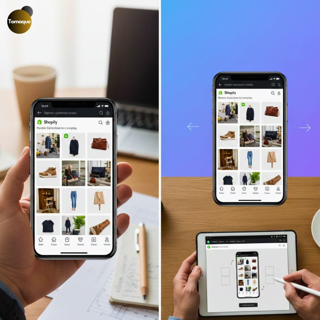
Product thumbnails serve as the first visual impression of your products. If they are too large, they may slow down page loading times; if they are too small, they may appear unclear and unappealing to users. Striking the right balance improves the user experience and increases conversion rates. Here’s why optimizing thumbnail sizes is crucial:
- Faster Page Load Speeds: Smaller image sizes reduce the time it takes for a page to load, preventing visitors from bouncing.
- Better User Experience: Properly sized thumbnails ensure customers can clearly see product images without zooming in.
- Higher Conversion Rates: Well-optimized images can improve engagement, leading to more sales.
- SEO Benefits: Google considers page load speed in rankings, and optimized images contribute to better SEO performance.
Recommended Product Thumbnail Sizes for Shopify Mobile
Shopify provides flexibility in thumbnail sizing, but choosing the right dimensions ensures a smooth experience for mobile users. Based on best practices, here are the recommended thumbnail sizes:
- Square Thumbnails: 200×200 px to 400×400 px (ideal for mobile grids)
- Portrait Thumbnails: 300×400 px to 400×600 px (better for apparel and accessories)
- Landscape Thumbnails: 400×300 px to 600×400 px (ideal for wide-format product displays)
Keeping file sizes under 100 KB per thumbnail is recommended to ensure faster loading speeds.
How to Optimize Product Thumbnails for Mobile on Shopify
1. Choose the Right Image Format
Using the correct image format affects both quality and speed. Shopify supports JPEG, PNG, WebP, and AVIF formats. Here’s what you should consider:
- JPEG: Best for high-quality images with smaller file sizes.
- PNG: Supports transparency but results in larger file sizes.
- WebP & AVIF: More advanced formats that offer high-quality images with smaller file sizes.
2. Compress Images for Faster Loading
Large image files can slow down your Shopify store on mobile. Use compression tools to reduce file sizes without sacrificing quality. Some effective tools include:
- TinyPNG (tinypng.com)
- Shopify’s Built-in Image Compression
- Kraken.io
- ShortPixel
3. Use Shopify’s Built-In Image Editor
Shopify allows you to edit images directly within the platform. To optimize thumbnails:
- Go to Products > Click on a Product
- Click Edit Image
- Adjust the size and crop as needed
- Save and update your store
4. Implement Responsive Images
Responsive images automatically adjust based on screen size, ensuring your thumbnails look great on any device. Use CSS media queries to define image sizes for different screen widths.
@media (max-width: 768px) {
.product-thumbnail {
width: 100px;
height: auto;
}
}
Adding this to your Shopify theme’s theme.css file ensures that thumbnails adjust dynamically for mobile users.
5. Optimize Shopify Theme for Mobile Display
Some Shopify themes may not display thumbnails correctly on mobile. If you notice distortion or improper scaling, check your theme’s settings:
- Go to Online Store > Themes > Customize
- Navigate to Product Grid or Collection Pages
- Adjust thumbnail sizes in theme settings
- Save and publish changes
If your theme doesn’t allow customization, consider switching to a mobile-friendly theme like Dawn, Brooklyn, or Debut.
6. Enable Lazy Loading for Thumbnails
Lazy loading ensures that images load only when they come into view, reducing the initial page load time. Shopify has built-in lazy loading, but you can enable it manually using:
<img src=”thumbnail.jpg” loading=”lazy” alt=”Product Thumbnail”>
This will ensure that images don’t load unnecessarily when a page first opens, improving speed and performance.
Optimizing product thumbnail sizes for mobile on Shopify is a crucial step in improving user experience, site performance, and conversions. By choosing the right image sizes, compressing images, using responsive design, and implementing lazy loading, you can ensure that your Shopify store is fast, visually appealing, and mobile-friendly.
If you need expert help with Shopify optimization, our team at ShopifyEcommerce is here to assist. Contact us today to enhance your store’s performance!